


EliteATS website design
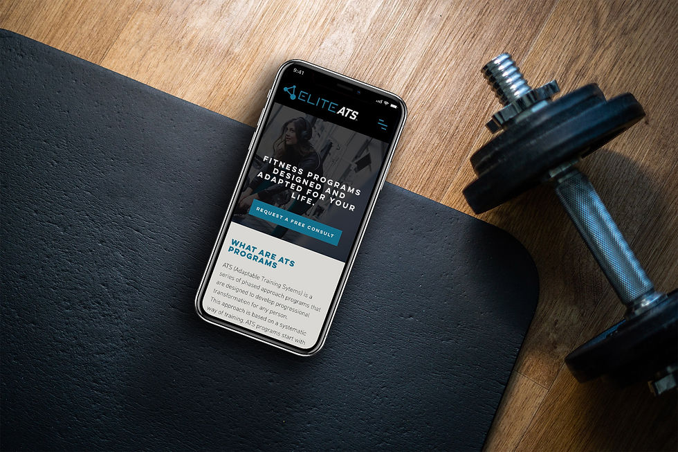
Project: EliteATS is my online personal training company. It is a collection of online fitness training programs, nutrition coaching, and contest preparation for competitive physique athletes. One of the primary goals of this website was to showcase the fitness services provided in a clear, coherent eCommerce experience. A secondary objective was to provide educational awareness of the positive benefits of change through fitness, health, and wellness. The site also had to appeal to a diverse population, all levels of fitness knowledge, and feel fun, friendly, and approachable.
My role in this project
During the entire duration of this project, I led the overall design experience of EliteATS.co for both mobile and desktop. This included oversight and direction of the following key roles:
Research and Insight
I led research efforts with targeted audience participants to gather data and insights to help inform the user experience.
Content Strategy
I was responsible for content development across the entire site. I also provided strategic oversight of the design direction.
Planning and Project Definition
I led project planning, including managing timelines and requirement planning.
Design Execution and Direction
I led the design direction across the lifecycle of the project. This included the execution of the wireframes, prototypes, and information architecture.
The challenge:
What are the customer needs of an online training program
With the rise and popularization of online training apps and video coaching services, the consumer has access to more options than ever before. As a result, the fitness industry has gone through a transitional period where companies have embraced an omnichannel marketing approach to meeting the demands of the customers.
The challenge was to create a website that would address the fitness needs and demands of the consumer in an era rapidly moving toward online connected fitness.
EliteATS would offer online fitness training programs and nutritional coaching designed to help progress the health and wellness of its customers based on their fitness level. With these services, the aim was to deepen the customer relationships and build customer acquisition.
The research:
User interviews and insight
To gain greater insight into why our target audience would consider using this website, I used a qualitative research approach to conduct user interviews during the planning phase.
Field study research
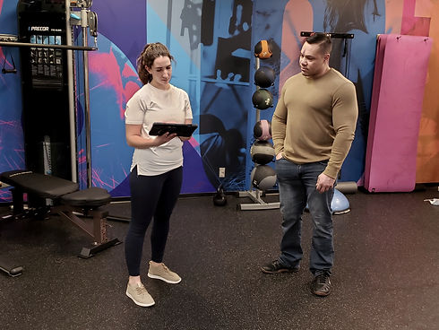
During this phase, I used a combination of semi-structured interviews and in-person contextual inquiries. I used the research method to gather information about in the user's environment.
The findings:
What was discovered
After wrapping up the user research interviews, I began to analyze contextual inquiry data. To do this, I synthesized the insights into findings. Using card sorting as a UX method, the goal was to understand the mental model of what content test participants prioritized most when looking for an online fitness training service. I started by sorting the findings into categories that represented the needs of the user, while addressing product requirements.

From this exercise emerged some compelling findings. One that surfaced over time was that users wanted to experience a fitness training website service that adapted to their lives. To address this, I knew the site had to be flexible and offer services that would account for the physical, personal, and emotional health of its users.
The personas:
Grounding the research to inform design direction
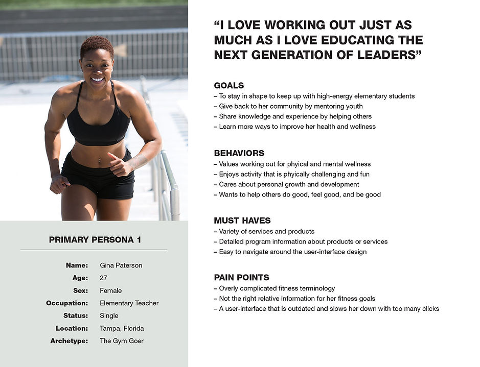
Now that the research was done, I was able to validate what users were asking for and why our participants would consider using EliteATS. I needed to translate this into characteristic traits to connect the user experience. I developed personas to ground the research and to establish empathy for design direction with the user in mind.
The sketches:
Starting the ideation process
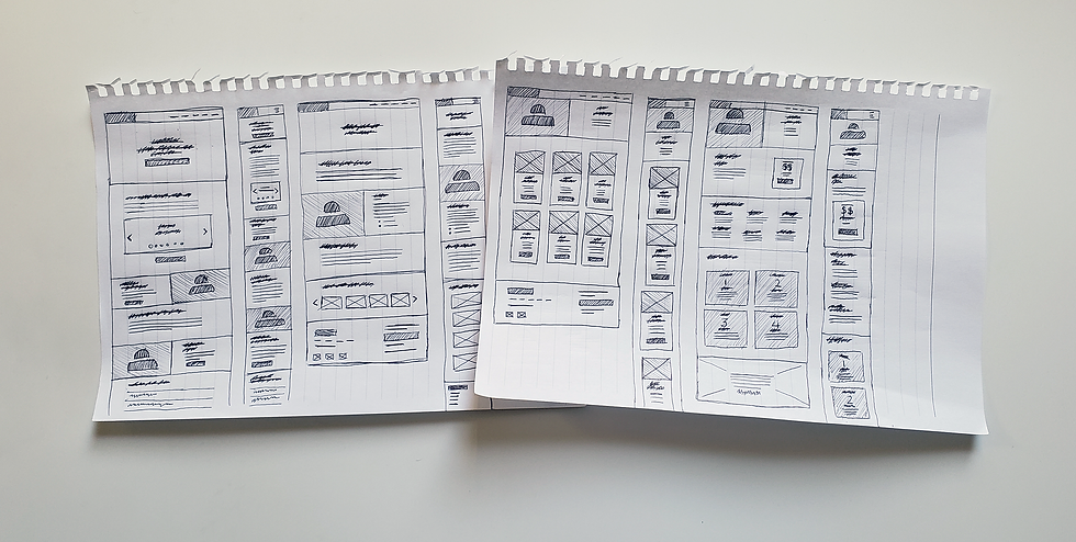
Shortly after developing the persona decks, I began to move into the ideation phase. I started conceptualizing low-fidelity sketches to inform what the design direction would look like.
In this phase, I began to generate with pen and paper. This allowed me to ideate rapidly without investing too much time in the design phase. Here, I was able to translate the qualitative user insights gathered during the contextual inquiries into draft mockups by the participants.
The prototypes:
Using high-fidelity wireframes for user testing
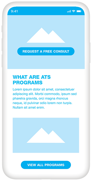
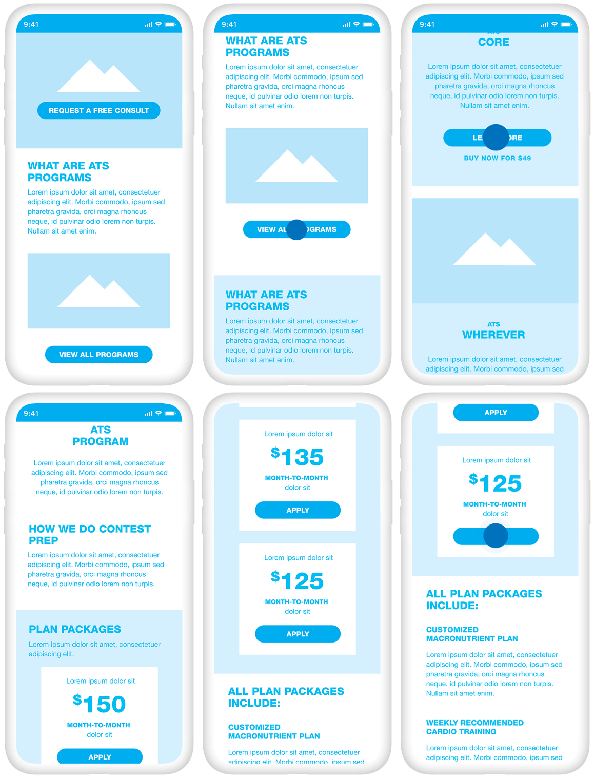
At this point in the design thinking process, after synthesizing, categorizing, and brainstorming concepts, I began prototype development for user testing. From here, using a high-fidelity wireframes approach to capture many of the findings and to build the representational layouts.
Next was to define the key content elements to be tested during usability testing for the prototype. To do this, I created a test plan diagram to outline the objectives and goals. I wanted to validate how quickly and successfully our test participants could purchase a fitness training program.
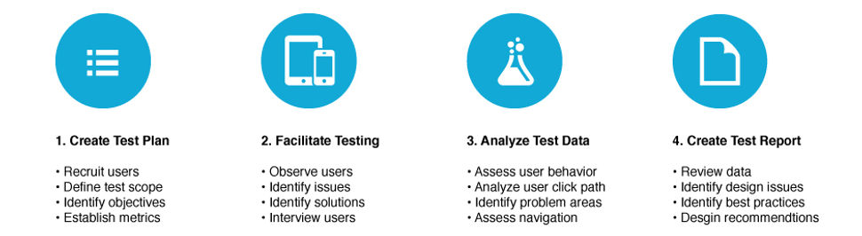
Once the usability test diagram was defined, outlining the methodologies used for testing the high-fidelity wireframes, it was time to get the prototype in the hands of our test participants. For this, I recruited the same user group for user interviews to keep data valid during testing.
The results:
What was learned and validated during usability testing
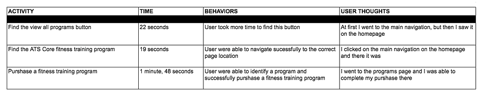
The primary goal of this usability test was to assess how quickly and successfully test participants could navigate to the purchase fitness program button. After testing was complete and I was able to track, time, and analyze the click path data, I learned that 4 of the 5 users successfully executed their task. This helped confirm and validate the threshold confidence rate.
During the user evaluations, each of the 5 participants' effectiveness was evaluated on a pass/fail rate for each of the tasks listed below. I also documented user behavior and thought sentiment to validate navigation tree structure and ease of use when purchasing a fitness program.
The architecture:
Understanding how users navigate for better usability
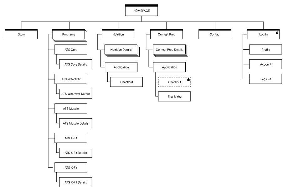
Once I had much of the user research and usability testing complete, I began tree testing the navigation structure. I began organizing pages based on the user goals identified in the synthesized findings, categorized from the card sort exercise. By doing this, I was able to prioritize the architecture page elements to support the user's mental model.
The palette:
How using colors defined the design direction
As I began to think about how to continue cultivating the user experience in the design process, I considered what color scheme would be most appealing to our target audience. Based on early user insights, I knew the color palette needed to express the emotions of a modern-day fitness site. To do this, I researched large-scale fitness clubs, boutique gyms, and mobile apps to see how they used color to influence perception and persuasion.


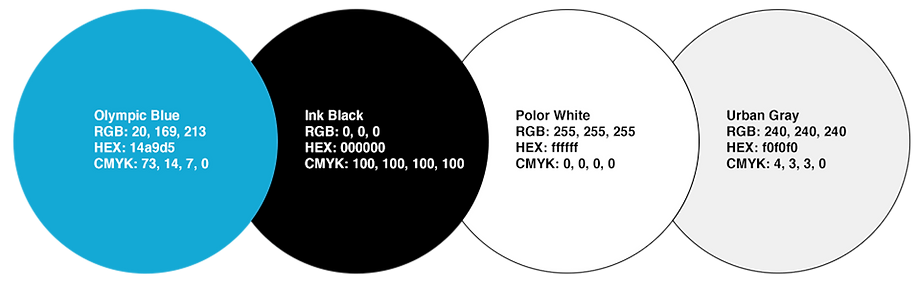
After sifting through much of this visual research, a color palette started to emerge. I noticed that many of the examples documented used blue. At this point, I realized I had two options. 1.) Adopt a similar approach. 2.) Do something different. At the end of the day, where I landed was somewhere in the middle. The reason for this decision was that I needed a color palette that could appeal to our target audience demographic while expressing approachability and authenticity. The color palette descriptions are where I landed.
Olympic Blue
Honest, confident, contemporary, intelligent, trustworthy, healthy
Ink Black
Sophistication, Power, Formal, Strength, Success, Authority
Polar White
Simplicity, Openness, Clarity, Hope, Minimal, Balance
Urban Gray
Modern, Neutral, Control, Practical, Reliability, Professional
The refinements:
Bringing everything all together
At this stage of the project, I was ready to start the user interface design. However, before I could begin this, EliteATS lacked sufficient brand identity. What was needed was a logo that would express the nature of the business and tell its story to its users.
Logo concept design
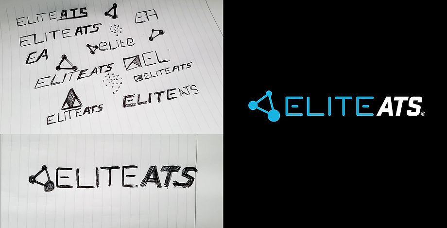
The first step I took was to sketch with a pen on paper, which allowed me to ideate quickly. I explored various ideas before refining the logo using Adobe Illustrator for the final output.
What inspired this direction of the logotype was the idea of molecular bonds and their ever-changing nature. Much like the training programs and their core offerings, all are adaptable to an individual's fitness level. Therefore, the three-sided molecule bond became the identifier for the company.
Mobile and website design
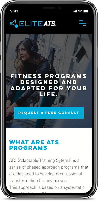
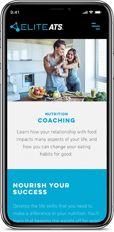
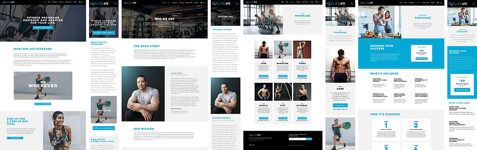
Now that the logo was finalized, I took a mobile-first approach to create the user interface design and the website. To do this, I used tools like Figma. I also built components to support a responsive framework during development. This allowed customization to CSS files, JavaScript, typography, forms, buttons, navigation, and other interface graphics, ensuring the experience remained flexible and scalable.

The Validation:
Testing to confirm assumptions of the user experience
Once the designs were finalized and the prototype was working, I wanted to get the IU refinements back in front of our test participants. I wanted to confirm that current assumptions and findings from our usability test, along with task requirements, met the needs of users and the broader target audience.
Last-minute pivots
During testing of the final prototype, users noted slow load times for some of the content. This was a sobering moment that showed connection speed matters. I had become so focused on validating assumptions that load time took a backseat. The bottom line was that (of course) load time did matter. Performance and reliability are at the heart of the user experience.
The conlusion:
What I learned
At the start of this project, I had no idea what type of service-related product would come from designing and building a fitness website. I did know I had to ask why this type of industry mattered to consumers. By figuring this out, I knew at some point during the UX process, I would find what the customer desired. I wanted to make sure I was "designing and building the right thing." It became less about how quickly I could deliver a service-oriented brand and more about producing an intuitive, reliable customer experience.
Throughout this entire journey, some moments challenged my resolve. One instance was during the development of the site. Outsourcing the POS checkout page to an outside vendor proved more challenging than I had planned for during the project timeline. Midway through the development, we ran into several issues with API tokens, database form, and more... I knew I did not want to sacrifice the user experience. I still wanted to make sure the level of performance and reliability was not compromised.
After many late hours, I realized that collaboration relies on a mutual partnership to work as a team to tackle a task. Collectively, the vendor and I solved many of these issues, even though we had to travel down different roads from time to time. By working together, we reach our goal.
At the end of the day, what I learned from this is that there is always a give-and-take relationship between art and science. Although they can function independently, they work best when combined to create a meaningful user experience. An experience that should never be compromised. Experiences like this can only be possible if the whole team truly shares the same values and aspirations.


