Snap Fitness mobile app design
Project: Lift Brands was in need of a new mobile app that would help meet the needs of their business and its members. They wanted to create a mobile app that would give their members access to many of the in-club experiences that are offered. In order to do this, the mobile app had to meet several key objectives. Some of the objectives included: allowing members to pay membership dues through the app, access to virtual and in-home workouts, and enable geofencing for club locations. In addition to the key objectives, the user interface needed to be intuitive, easy to navigate, and allow for an engaging user experience.
My role in this project
During the duration of this project, I was one of two lead designers that were responsible for the interface design of the Snap Fitness Member Experience app. This included the following key roles:
Content Strategy
I worked side-by-side with the content creation team during the entire lifecycle of the project to develop content for the app. I also helped with the execution strategy during the rollout of the app for specific content.
Design Execution and Direction
I was responsible for leading the design direction across all sections of the mobile app during the duration of this project. This included: wireframes, prototyping, creative presentation, and getting buy-in from stakeholders.

The solution:
The process of building the Snap Fitness mobile app
During the early stages of this project, I was asked by team stakeholders to come up with a few concept screens to show how Lift Bands subsidiary company, Snap Fitness could improve the user experience and interface design of its member-facing app.
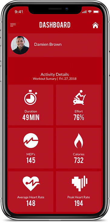
As this project began to evolve, so did the content of the app and how it needed to perform. As a result of this, I began to think about what features were most important to the user. Some of these included: integrated connectivity in the app as a way to track data points, calories burned, user heart rate, workouts completed, and more. Once many of these key must-haves were categorized and prioritized, I went into wireframing the user experience using Adobe Experience Design. From here, after confirming feedback and validating assumptions, I went into designing the user interface for the final prototype.
The following work below is a brief example of what was created for this project and my thought process for it.
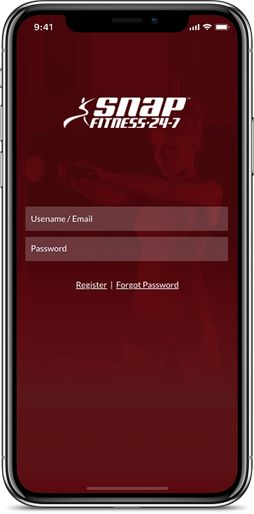
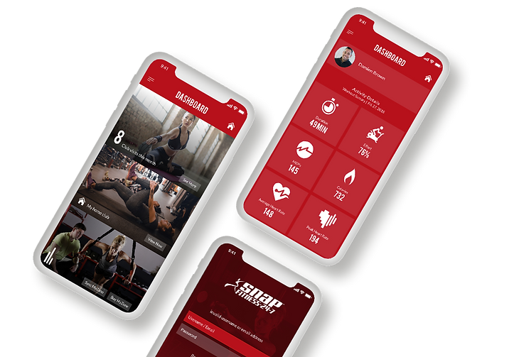
Landing screen and dashboard navigation
Using a customized log-in allowed for information that was directly related to the user to be displayed. The landing page also displayed related content for quick and easy access. Using tiles provided visual clarity and improved ease of use by leveraging space instead of drawing lines. This helps to define different sections in a non-obtrusive manner for a better user experience.
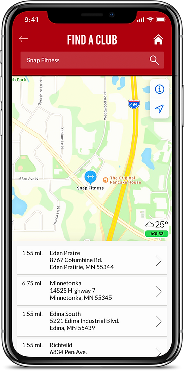
Geofencing and club location
Using Apple Maps API for club locations provides an intuitive and native user-interface experience that made it easy to use and navigate. Using a tile design approach helped separate content making it easy for users to find pertinent information.
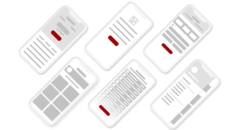
User-interface screens
During the prototyping stage, over 20 screens were created. By exploring multiple user-interface options, it provided insight to identify pain points and areas for opportunities to improve the user experience.
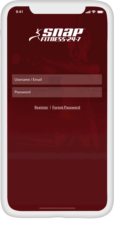
Mobile app prototype
Creating a prototype validated user assumptions for clarity during the testing stage. This allowed for better usability and in return creates a better user experience.
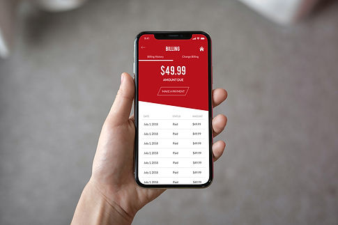
In-app billing
By using specific user experience elements like layering can help increase the depth and identify the relationship between different items, and draws attention to certain items.