Rasmussen School of Nursing landing page redesign
Project: Rasmussen University was undergoing a branding refresh to modernize its website to accommodate the growth of its continuing education audience. With its high enrollment, the school of nursing was the first program to be redesigned as a pay-per-click (PPC) landing page. Each nursing degree program needed to work collectively while under the Rasmussen band umbrella. As part of the objectives, the brand refresh called for a more contemporary look to keep up with the ever-evolving continuing education landscape. Other objectives included making sure the user interface was intuitive, easy to use, and appealing to a diverse audience of prospective students.
My role in this project
During this project, I had several major roles as the Art Director for Collegis Education. This included the following:
Design Execution and Direction
I helped lead design direction for the Rasmussen School of Nursing landing pages during the school's brand redesign.
Project Scope and Definition
I collaborated with key stakeholders from the account and content strategy teams to define project deliverables.

The solution:
The challenge developing a new look for a historical brand
At the start of this project, and as the former Art Director at Collegis Education, Rasmussen University (formerly Rasmussen College) was undergoing a strategic refresh, focusing on its suite of degree programs tailored for busy adults and designed for self-paced learning. This included the design direction and development of the School of Nursing's PPC landing pages. These pages were chosen based on the popularity of the School of Nursing and its degree offerings for working adults. Internally, these pages represented something different—an opportunity to drive traffic to a degree program with market demand and strong ROI for the University.
During the initial research phase, there were prior analytics on prospective nursing students in the marketing funnel. Many of these prospects were aware of the nursing program; however, they failed to complete the inbound market input form to be classified as a qualified lead. The program also wanted to increase the percentage of this number to validate a new master's nursing program. To achieve the objective, I needed to understand what was working and what was not working to become a nurtured lead. To do this, I worked directly with the internal product owner and the client, Rasmussen University, to understand what intrigued their current continuing education student base to apply. What I learned was that student prospects wanted more quick-hitting statistics that could validate their decision beyond the awareness stage and into the consideration phase of the consumer funnel.
The following work is a brief example of what was created for this project, and my process for it.

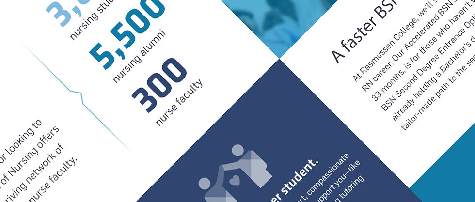
Angled geometry
During the ideation phase, the transparency of the Rasmussen logo served as inspiration for the overlapping angles and was used as a banding element. The directional movement of the forty-five-degree angles created a subconscious connection to the brand, allowing consumers to identify with the new look and logo.
These conceptual elements would go on to define the brand and be used throughout the website's product pages—and even in the iconography.
Desktop website callouts
As part of the redesign, using statistical callouts throughout the website as a graphic treatment allowed prospects to process quick, easy, and relevant information to support their decision-making process during lead capture. This tested well and showed a significant lift in user engagement and time spent on the website. By leveraging these insights, I was able to apply what was learned and translate it into a product experience that addressed a consumer need.


Mobile website screens
With a high rate of user engagement coming from mobile devices, adopting a mobile-first approach was also key to ensuring the product experience could meet prospects on their terms. Because of this, I developed a mobile experience that was easy to navigate and focused on content that mattered to nursing students, while maintaining flexibility to scale across all program offerings.


Typography
The typeface also played a role in the brand architecture. Kalula was chosen due to its professional look, contemporary style, flexibility, readability, and the way it exemplified the character of the Rasmussen Nursing program.
Iconograph system
The custom icon system was designed as an extension of the brand refresh. Each icon was created using Adobe Illustrator and intentionally designed to incorporate the angled geometric style to elevate the brand identity.